Lady Bird
expanding the online presence of a boutique thrift store


The Brief
Lady Bird is an online thrift store, born from a love for up-cycling and vintage clothes. It's founder, Latika, features one-off pieces she sources from exporters around the country, her own travels and flea markets.
The Goals
The challenge was to design an intuitive and responsive website from scratch, one that was aptly aligned with the brand identity. The branding also needed some development and refinement to account for expansion.
research
the approach
To kick things off, I drafted a research plan to better understand my intended audience.
I aimed to have conversations that spark insight into the user's buying patterns online

how do they feel about the idea of 'thrifting'?

what do they miss about shopping at a store front?

how do they measure a product's utility w.r.t. its price?
findings
- Online shoppers, especially young women were more open to up-cycling affordable clothes.
- To be able to contribute to the sustainability movement while at it was an added bonus.
- Shoppers liked the idea of sorting through stacks of seemingly useless clothes to find something that works well for them
- They appreciated the decentralisation in their shopping routines, moving away from bigger brands
- Having somebody else curate collections for them was an added bonus, like an affordable personal shopper
user pain points
- A lack of trust at first, but easily combated with transparent reviews
- Less transparency with defects
- Neglected customer care
- Skewed demand and supply owing to one off pieces
These findings helped me create a persona for the ideal user of Lady Bird.


Defining the solution
information architecture
The next step forward was defining the information architecture that was going to form the layout of the site.
A sitemap was created keeping in mind that I wanted to retain familiarity in certain fundamental elements such as navigation. This sitemap helped ideate, classify and prioritise all sections of the website.

Finally, with just a pencil and paper, the user flow was created keeping all the myriad of ways a user could purchase a t-shirt on the site in mind. This helped bring clarity to the information structure.

Wireframing
low fidelity sketches
Now for the fun bit, bringing together the abstract properties we identified to create an actual product. Rough drafts of the wireframes were sketched on paper.
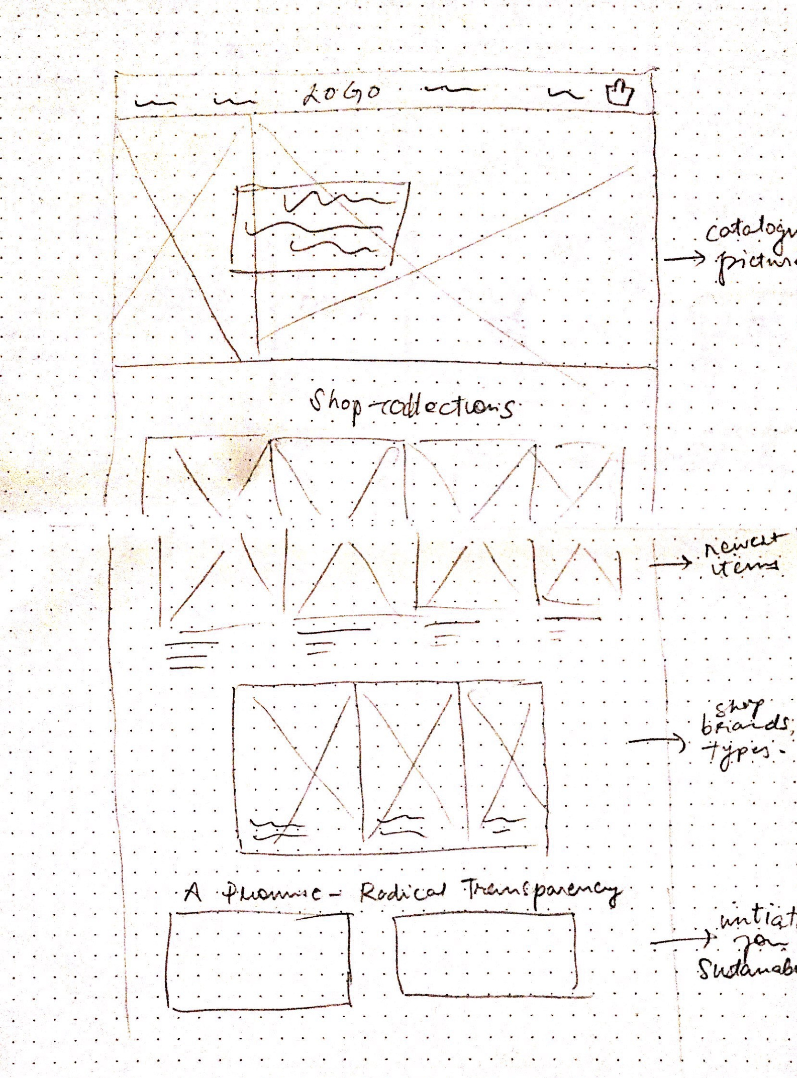

For this particular site, I wanted the collection and curation to do the talking.

I wanted the homepage to help users gather whatever information they could possibly need to make decisions quickly (determine authenticity/quality, explore options or quickly navigate to the catalogue screens).

From this point, the wireframes were built on Figma keeping the persona and feature roadmap in mind.

making it responsive
Lady Bird started out as an Instagram thrift store, meaning most users would be accessing the shop via mobile. This made having top notch responsive design a priority.
Once a general gist of the wireframes was clear, I started work on the responsive versions.

Branding
While crafting the branding for Lady Bird, the aim was to stay true to the image the client had in mind, considering she had been directly dealing with her consumers and knew their expectations best.
The vibe had to be young- but vintage, nostalgic, easy going and inviting.
.gif)
choosing the optimal colour scheme
I started off with a sharp deep red, which didn't stand well to being used abundantly all over the site. The crimson red would mostly evokes anxiety and restlessness in users, so I turned to various shades of a muted pastel green to serve as the brand colour juxtapositioned with a bright mustard for the highlights.

ensuring efficient checkout
The checkout page ha been subjected to multiple iterations given it's text-heavy and relatively monotonous layout. I aimed to keep the process as crisp and elegant as possible so as to not have users get bored and leave at the last leg since it demands more interaction from users than anywhere else.

cleaning up filters and text-heavy areas
The catalogue page is particularly game-changing.
Our user has decided to go ahead and check the products out, and they expect the sorting process to be highly intuitive.
Filters were constructed keeping research closely aligned. While filters, by nature, are text-heavy I tried to reduce cognitive load by dividing them in 2 broad subheading which opened to reveal more choices, not more than a couple words long, at the maximum.

Considering the one item-one size model of the business, quality details and fitting were of paramount importance to the user, and thus were prioritised right under the description.
logo
Coming to the style tile, there was already a stellar logo in place showcasing her brand identity to the T.

colour scheme

typography & buttons

All branding elements were simple, chic and effective in visually translating Lady Bird's free flowing nature.
prototype
Before diving into testing, feel free to have a look at the prototype I created for lady bird's website
here.Testing
Usability Testing, conducted online with screen sharing, helped uncover a lot of biases that had creeped in and also offered a fresh perspective. Have a look at the testing draft
here.
notable findings
- The banner image elicited a subdued response. Some people liked it’s colors but almost all agreed that it didn’t give out as much information as they would’ve liked.
- Reviews elicited a unanimously positive reaction. Users took away a lot of information and moved further with more trust in the brand.
- A user thought there were 3 different ‘themes’/ ‘aesthetics’ with each section on the homepage, and didn’t have a lot of commonality.
- Some users would like more variety in filtering and product photographs.
- The shopping bag could be much smaller and more consolidated with displaying the items. Users would also like to know the subtotal and have the ability to edit so as to make relevant changes before checking out.
- The checkout page gathered a mostly positive review. Users knew where to find relevant details and actions.
recommendations and next steps
These changes and suggestions were first classified and then visualised in an affinity map according to their priority pertaining to the effects on users and the vision for the brand. The map helped divert attention to user issues that were prominent across the spectrum, paving the way for much-needed iterations and tweaks.

The HQ header image was swapped for a bunch of polaroids of LB’s own clothes, creating a more intimate dynamic.

The elements and text were scaled down proportionately and a few more relevant filter choices were added.
The shopping bag was also tweaked to enable users to add/subtract items and access more important information regarding prices and quantities.
reflections
Lady bird helped me shift the focus to UI and branding. I appreciated being able to completely redesign the UI and still retain the essence of the brand that lady bird is. This was also my first e-commerce project, which itself had a lot of firsts.
Testing helped uncover a lot of biases I had developed while designing the site, the changes to the imagery, adding more functionality to the shopping experience- were all an effort to try to make the virtual experience as intuitive as the physical experience, if not more.
