Circles
introducing a new social feature to spotify to boost engagement and user retention


The Brief
Spotify is arguably the biggest player in the music streaming industry, and it wants to solidify its position by using an innovative & relevant new feature that increases user retention and engagement and blends into its existing UI seamlessly.
The Goals
The obvious challenge was finding a way to integrate social characteristics into a feature for a music streaming service. While the app already has some core capabilities, like following artists/friends and getting to see their listening histories, they don’t do much in terms of retention.
research
the approach
Before kicking off into research, I had to come up with the feature that would suit Spotify's needs best.
There were some broad ideas circling around leveraging social aspects but I knew I wanted the medium of communication to not be visual as much as it is auditory, keeping in line with Spotify’s core functions.
This is how Spotify Circles came to be.
the concept
A baseline concept was that of a 'public square' that facilitates the exchange of ideas between the general public, via conversation or public speaking.
Spotify users would be able to move in and out of different 'meetings' where notable (or not) people are speaking and engaging in conversation. The presence of different rooms at all times ranging in different types of interests will keep things interesting in a way that podcasting doesn't.
the approach
Research involved a survey that would gauge

How do users interact with the existing social features on Spotify?

Where do the boundaries lie between artists & other users?

How do users manage distractions with podcasts?

What prevents/ adds to migration?
There was also a second round of research that involved 1-on-1 interviews which gave way to a more nuanced understanding of tastes, interactions and thoughts about long form entertainment.
notable findings
- Users loved the famous Spotify algorithms that suggested music they genuinely enjoyed.
- Users who liked creating playlists, did so for friends and followers just as much as they did it for themselves.
- Users were also seeking inspiration from artists, peers and public figures w.r.t. their personal taste in music.
- Features that encouraged music discovery relative to moods, genre et al were also heavily used.
- Podcasts were enjoyed for their ability to make users think deeply and have better conversations albeit the long running time added pressure to
pain points
- A complicated and extensive onboarding process for someone who wants to put their music on the platform.
- A lack of engagement on long form podcasts.
- Underwhelming engagement from artists and not a lot of content to help understand their process in creating music.
Defining the Solution
With a greater understanding of Spotify’s hits and misses, adding in details to Spotify Circles’ functionality became easier.
Mapping out the information architecture was a smooth process considering the app already existed.
task flow
I created a task flow & user flow that focused on hosting a ‘circle’ as a first-timer.
Creating a circle means you can invite other users onto your own ‘public square’ of sorts and there can be a free flowing conversation that can allude to the music that is determined by the creator in the form of a playlist.
.png)
user flow
The user flow helped orient the feature with its placement in the app. It also helped bring out the most important steps that a user might take whilst hosting.
.png)
I created a persona from the research I had gathered thus far

Wireframes & Interface
increasing fidelity
Always the fun bit! Low fidelity wireframes highlighted the layout of the feature in all its functional glory.

Creating a circle and joining an ongoing circle came out to be the top functions of this feature, thus they enjoyed maximum screen presence.
working with spotify's ui
Aligning the circles UI with the rest of the app was a quick process, however, aligning the novel features, like adding a mute button, conceptualising the layout of the ongoing circle, figuring out how the selected playlist is displayed - all under the restraints of Spotify’s style tile was definitely uncharted territory.

concept based features
As is evident from the final UI, a user can have the ability to speak in a particular circle- this discretion is afforded to the creator who can add and remove speakers in real time, moderating the quality of conversation.
I also gravitated towards a text-heavier circle card that gave out some informational context about that particular episode as opposed to one that only showed the name and creator.

Another important decision made was to add in the ‘happening now’ section- which also had a small seat on the homescreen. Users gravitated towards experimenting when they didn’t have to make a lot of decisions before getting to see the inner workings of Circles, they liked exploring offerings on the homescreen far more than anywhere else.

'Your top circles' featured popular circles that were ongoing and didn’t need the user to even type in a circle code to join in, only a tap on the name card.
Visual Branding
The branding aspect for this case didn’t require much intervention. Spotify’s simplistic and seamless UI was fairly easy to adjust to and the multitude of UI kits online helped me understand the smallest details.
The only task here was to align the new screens and the novel circle layout with the rest of the brand identity. I used darker tones, with the famous Spotify Green sprinkled over for highlights.
Prototyping
An effective prototype was key in allowing me to test the effectiveness of visual hierarchy, priority, and flow on the user’s end. Have a look
here.I aimed at fulfilling the task outlined in my task flow- a user explores the functionality and creates a circle to host.

Testing
In order to test the overall quality and ease of navigation throughout the whole design, and to observe areas of errors/difficulties, I went out and had 5 participants interact with my prototype.
I used a remote testing method, observing their shared screens on video call and asking questions as they came to me. Have a look at the usability testing draft
here.notable findings
- At first glance, most participants likened the new feature, Circles to a podcast sharing service, with the possibility of more interaction.
- Almost all users didn’t quite understand the relevance of the music and the playlists, owing to less emphasis on this aspect visually.
- Almost everyone wanted access ( at least to be able to listen if not create ) to popular and ongoing Circles from the homepage itself.
- The lack of a need for visual engagement to fully utilise the feature was a welcome change for people looking to curb their screen time and mindless scrolling.
- Users also likened it to being much more intimate and interactive than a podcast, helping curb distractions that crop up with long-form conversations.
- Younger users are especially keen on being able to host live listening parties for new albums with peers, fans and artists and share their novel reactions.
next steps
- While a solid amount of issues were brought to the surface, their solutions seem fairly simple.
- The highest priority was to curb the confusion people seemed to have when faced with Circles, especially considering it carries a range of functionalities within itself and would need some exploration to make users feel at ease with it.
- Using the recommendations and feedback received from testing, I decided to make some adjustments to the prototype.
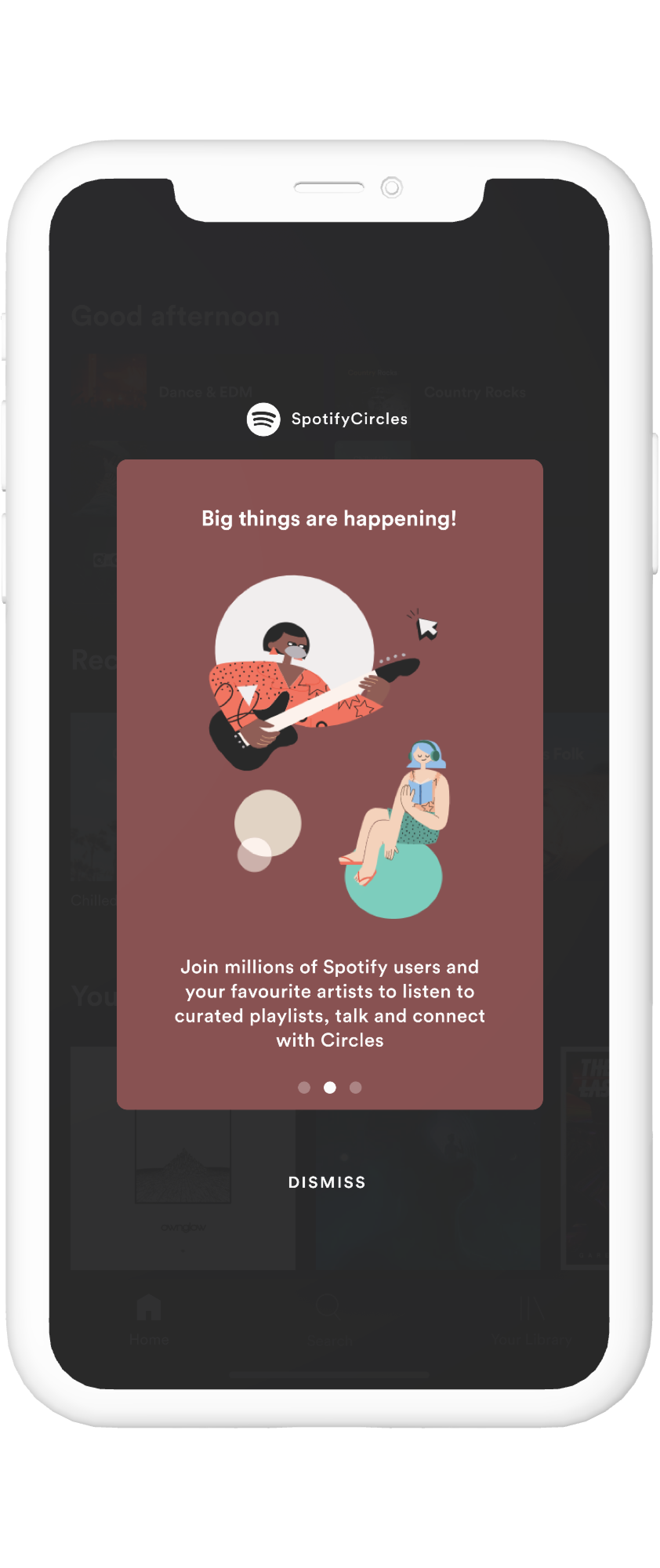
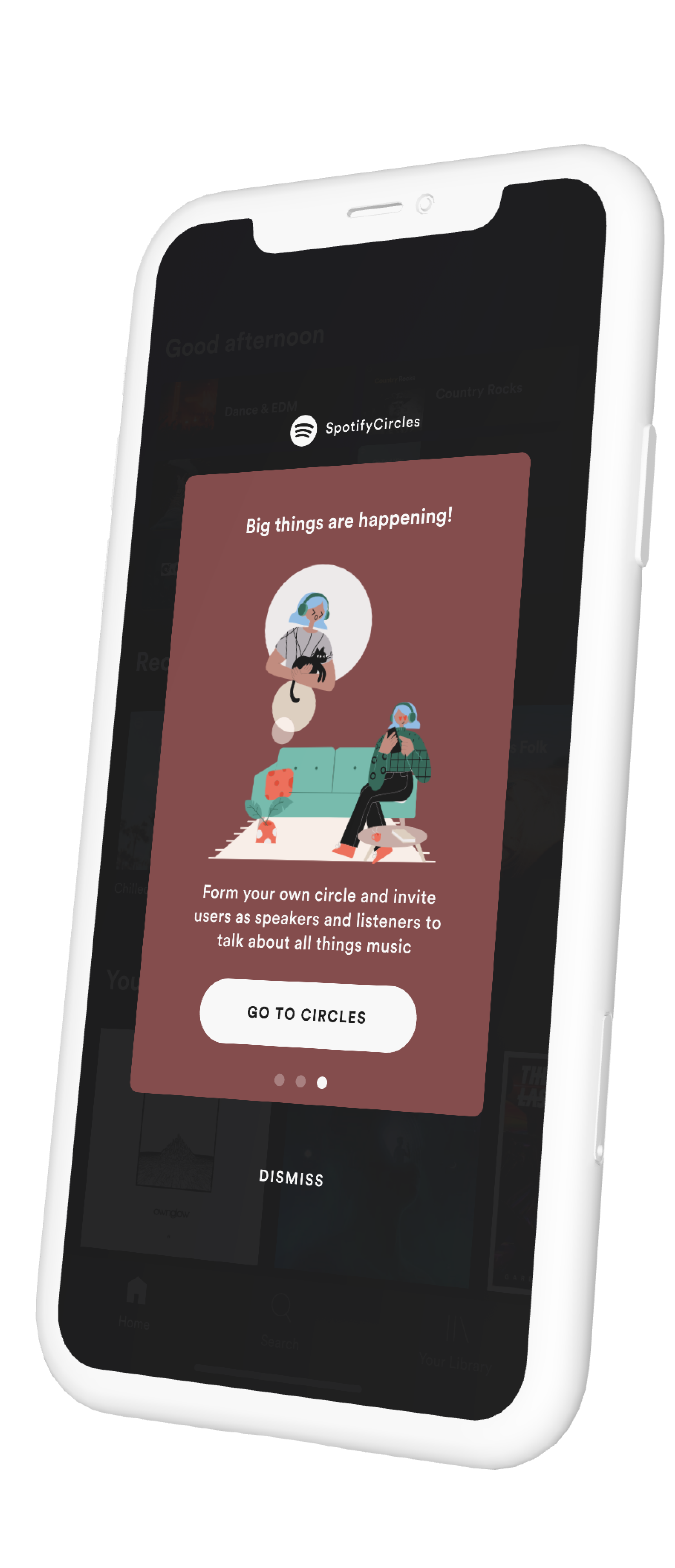
adjustments
- Primarily, I added introductory screens with the first one being all about the user's top artist and their new album being streamed live with them speaking via Circles.
- The next couple screens were to help orient the novice user to what the feature is all about.
- I didn't want to be too forthcoming with any one element because I believe the feature will eventually become what the users want it to, and in that sense I think it's important to only slightly nudge and not overwhelm the receiver.
reflections
Circles was a truly fun project, helping me understand the nuances of product design with ease. Being an avid user of the app myself, creating this hypothetical feature for Spotify warranted real world research into figuring out the next phase for auditory entertainment.
Since the beginning (or perhaps earlier) of this project, Clubhouse- an app that works on a similar tangent but without playlists and listening parties at it's forefront, has rapidly spread all over the world. This only makes me feel that much more sure about audio being revolutionised and garnering the same attention visual entertainment does, if not more.