asha+
promoting & mediating knowledge application, data management
& online consultations for health care volunteers in rural india


the brief
The problem of healthcare in India is not only vast, but also vastly interconnected and systemic. Despite being key components in helping bring up health indicators, mobilising the community towards health planning and becoming a trusted point of contact between physicians and the rural public, ASHA workers face a multitude of challenges from various ends of the system.
the goals
Creating a techno-centric model that helps solve the core issue at hand, not just symptoms of the problem, while ensuring that the needs of the people, capabilities of the providers & the ecosystem for the solution are accounted for at every step of development.
REsearch
THE APPROACH
Healthcare in rural India is a very well researched area. Thus, research was mostly secondary. The first task at hand was identifying the right problem to solve. I read on-ground journalistic reports, reached out to public health researchers and read their research papers. The idea was to get as close to the on-ground reality as possible regarding government initiatives and public-private partnerships with a critical focus on public health.
This helped me categorise broader issues into the following types of challenges-


availability
affordability
accessibility
defining the problem
Numerous 'How Might We' problem statements were defined to double down on all kinds of issues we had in front of us-
-HMW make it easier for women to have access to preventative medical information?
-HMW help build a secure online patient medical history database?
-HMW help make emergency treatment more accessible and mobile?
-HMW help states recognise location-specific prevalent problems & combat them?
I picked up the case of ASHA workers, primary health 'volunteers' who have been monumental in driving down maternal and infant mortality rates in only 15 years of implementation. These women are also not particularly literate (relative to urban counterparts), don't have access to a lot of resources and still carry the onus of raising their own children while managing the house.
Why, in a seemingly dilapidated health system, were they making progress?
ASHAs work for the community they sit with. They have an innate understanding of the complex situations that lead to pregnancy complications, malnutrition and infant deaths. Thus, they are better equipped to strike a chord with the women who need help.
This was the foundation for ASHA+, an app that was developed to enable access to virtual training and medical consultations. It also aimed to ease overburdening by facilitating data input and management, affording ASHA workers more time to focus on direct patient care and counselling.
Defining the problem
Once my stakeholder was identified, their problems were deeply scoured over-
- Abysmal & irregular training
with more focus on theory instead of practical applications, with a wide variation in the quality of training dispensed and their effectiveness producing skewed results.
- Human resource problem
A very skewed ratio of physicians available in-person for the urban vs rural population with skilled labour choosing to go into private healthcare and government centres left unattended.
- Delayed payments
Receiving negligible incentive-based payments after months of delay owing to no budgetary allocations for the NRHM fund.
- Overburdening
No defined roles and responsibilities, with workers spending a major chunk of their time manually filling out paperwork and surveys which they carry along while walking long distances to visit their cases.
Based on these insights, I created a persona to further empathize with the ideal user of this app. Meet Ratna.

information architecture
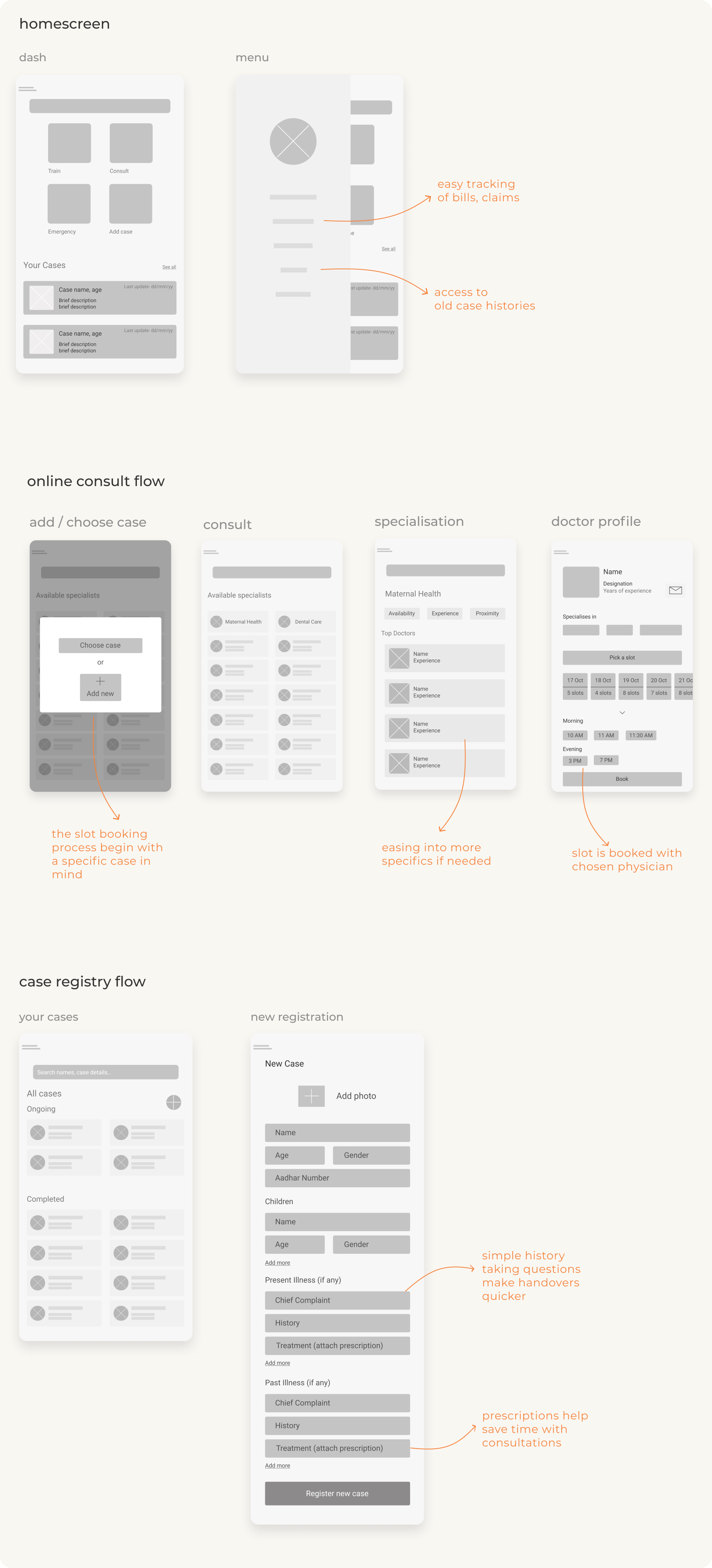
It was clear that the novelty for ASHA+ lies in its stakeholder. The primary aim for this app is to promote knowledge application and absorption via effective training that is constantly corroborated by online consults.
With my central features clear, I proceeded to the Information Architecture, creating an app map to clarify asha+’s feature positioning relative to the other features.
.png)
Configuring the first row of the app map further helped me map out the steps my user would subsequently take. Since this was my first app design, I also wanted to quickly see how this app map would shape up in wireframes, so I sketched out some screen ideas to test its viability.

.jpg)
The app map also helped double down on the primary task envisioned for the solution so I mapped out how the primary task would be carried out in the prototype in the minimum possible steps in the task flow.
.png)
Wireframing
With my defining IA in place, it was time to build on my earlier sketches, create variations and play around with wireframing.
The first wireframe featuring the homepage had smaller icons and the case depository was taking up most of the screen, the second version gave way to bigger icons and less textual cognitive load with only 2 cases visible before scrolling.

The first priority was to quickly orient my user with all of ASHA+’s offerings and attack their pain points identified earlier. Hence training, consultations, emergency services and case management became the primary icons the user is greeted with at first glance on the homepage.
Branding
Visual Branding was something that had been on my mind since the problem was identified. All through research, there were pictures of ASHA workers in their signature pink sari and I knew I wanted to keep my colours light and distinctively feminine. I began working on the interface of the homepage only keeping this in mind, allowing myself to play around with different colors, filters, tones and textures.
colour scheme
After much deliberation I arrived at a light, coral shade juxtapositioned with deep maroons and blacks, this kept things warm, light and inviting.

typography
Palanquin was chosen as asha+’s typeface as it was supremely easy to read in both english and hindi.

icons
Starting off with a sharp pink for my first draft, I knew I needed something to accompany the text that would sit on each rectangle alluding to its function (and these very specific functions) so I made the 4 icons sitting on the final homescreen.
detailing out the interface
With my icons ready, I went back to iterating on my broader interface. The pink was everywhere, so I toned it down and tried to incorporate it in my background instead. I finally arrived at the final draft whilst trying to keep things warm and yet feminine- closing in on the coral, black and white.

prototype
Have a look at the prototype
here.next steps
With a prototype ready to be tested, the next steps involve conducting usability testing on ASHA workers to find out what went right and what has to be fixed.


